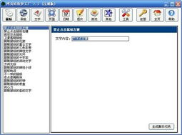
鼠标特效代码大全:鼠标特效代码大全,提升网页交互体验的实用指南
在当今竞争激烈的网络环境中,网页设计不仅要美观,还要注重用户体验,鼠标特效作为提升用户交互体验的重要元素,能够吸引访客的注意力,增强页面的趣味性和专业感,本文将为您整理一系列实用的鼠标特效代码,涵盖跟随、点击、悬停等多种效果,助您轻松打造独特的网页体验。
鼠标跟随特效
鼠标跟随特效是网页设计中常见的交互方式,通过让元素跟随鼠标移动,可以创造出动态、吸引人的视觉效果。

代码示例:
<!DOCTYPE html>
<html>
<head>
    <style>
        .cursor-follower {
            position: absolute;
            width: 20px;
            height: 20px;
            background-color: rgba(255, 255, 255, 0.7);
            border-radius: 50%;
            pointer-events: none;
            transform: translate(-50%, -50%);
            transition: transform 0.3s ease-out;
            z-index: 9999;
        }
    </style>
</head>
<body>
    <div class="cursor-follower"></div>
    <script>
        const follower = document.querySelector('.cursor-follower');
        document.addEventListener('mousemove', (e) => {
            follower.style.left = e.clientX + 'px';
            follower.style.top = e.clientY + 'px';
        });
    </script>
</body>
</html>
鼠标点击特效
鼠标点击特效可以增强用户点击的反馈感,让网页更加生动。
代码示例:
<!DOCTYPE html>
<html>
<head>
    <style>
        .click-effect {
            position: fixed;
            width: 20px;
            height: 20px;
            background: radial-gradient(circle, rgba(255,255,255,0.8) 0%, rgba(255,255,255,0) 70%);
            border-radius: 50%;
            pointer-events: none;
            z-index: 9999;
            transform: translate(-50%, -50%);
            opacity: 0;
        }
    </style>
</head>
<body>
    <button>点击我</button>
    <script>
        document.addEventListener('click', (e) => {
            const effect = document.createElement('div');
            effect.classList.add('click-effect');
            effect.style.left = e.clientX + 'px';
            effect.style.top = e.clientY + 'px';
            document.body.appendChild(effect);
            // 动画效果
            effect.style.transition = 'opacity 0.5s, transform 0.5s';
            effect.style.opacity = '1';
            effect.style.transform = 'translate(-50%, -50%) scale(2)';
            setTimeout(() => {
                effect.style.opacity = '0';
                effect.style.transform = 'translate(-50%, -50%) scale(0)';
                setTimeout(() => {
                    document.body.removeChild(effect);
                }, 500);
            }, 500);
        });
    </script>
</body>
</html>
鼠标悬停特效
鼠标悬停特效可以增强用户与页面元素的互动体验。

代码示例:
<!DOCTYPE html>
<html>
<head>
    <style>
        .hover-element {
            position: relative;
            width: 100px;
            height: 100px;
            background-color: #3498db;
            transition: all 0.3s ease;
        }
        .hover-element:hover {
            background-color: #2980b9;
            transform: scale(1.1);
        }
        .hover-element::after {
            content: '';
            position: absolute;
            width: 20px;
            height: 20px;
            background-color: rgba(255, 255, 255, 0.7);
            border-radius: 50%;
            transform: translate(-50%, -50%);
            left: 50%;
            top: 50%;
            transition: all 0.3s ease;
            opacity: 0;
        }
        .hover-element:hover::after {
            opacity: 1;
            transform: translate(-50%, -50%) scale(1.5);
        }
    </style>
</head>
<body>
    <div class="hover-element"></div>
</body>
</html>
鼠标动画特效
鼠标动画特效可以为网页增添更多动态元素。
代码示例:
<!DOCTYPE html>
<html>
<head>
    <style>
        .cursor-trail {
            position: fixed;
            width: 10px;
            height: 10px;
            background-color: rgba(255, 255, 255, 0.5);
            border-radius: 50%;
            pointer-events: none;
            z-index: 9999;
            transform: translate(-50%, -50%);
            opacity: 0;
        }
    </style>
</head>
<body>
    <script>
        const trails = [];
        const maxTrails = 10;
        document.addEventListener('mousemove', (e) => {
            // 移除旧的轨迹
            if (trails.length > maxTrails) {
                const oldTrail = trails.shift();
                oldTrail.remove();
            }
            // 创建新的轨迹
            const trail = document.createElement('div');
            trail.classList.add('cursor-trail');
            trail.style.left = e.clientX + 'px';
            trail.style.top = e.clientY + 'px';
            document.body.appendChild(trail);
            trails.push(trail);
            // 动画效果
            let size = 10;
            const duration = 1000;
            const startTime = Date.now();
            function animate() {
                const elapsed = Date.now() - startTime;
                const progress = Math.min(elapsed / duration, 1);
                // 轨迹扩散效果
                const newSize = size * (1 - progress);
                trail.style.width = newSize + 'px';
                trail.style.height = newSize + 'px';
                trail.style.opacity = 0.5 * progress;
                if (progress < 1) {
                    requestAnimationFrame(animate);
                }
            }
            animate();
        });
    </script>
</body>
</html>
鼠标特效是提升网页用户体验的重要手段,通过简单的代码实现,可以为您的网站增添独特的视觉效果,以上代码示例涵盖了多种常见的鼠标特效,您可以根据实际需求进行修改和扩展,希望这些代码能为您的网页设计提供灵感和帮助!
如果您有其他鼠标特效的需求,欢迎继续提问!
相关文章:
文章已关闭评论!